
You open your closet and see black, navy, beige, and more black. None of it is wrong. But every outfit starts to feel like the same outfit, and you’re tired of it.
I’ve fitted and styled women over 50 for years. One line comes up more than any other: “I want color again, but I don’t know which colors are mine anymore.” The fresh, trendy 2027 color trends for women over 50 are a smart place to restart. This year’s palette pairs one bold blue with soft, earthy shades that are kind to mature skin.
By the end of this guide, you’ll know your undertone and your contrast level. You’ll test each 2027 shade against your own face. Then you’ll pick three colors and mix them into clothes you already own, adding no more than five new pieces.
Why does this method work? Your skin and hair have changed since your 30s. The colors that loved you then may not love you now. Testing first stops the “pretty on the hanger, wrong on me” buys.
- ✔ Hand mirror (or your phone’s front camera)
- ✔ A window with daylight, 10 a.m.–2 p.m.
- ✔ 1 sheet of plain white printer paper
- ✔ 1 gold and 1 silver piece of jewelry (kitchen foil works for silver)
- ✔ 9 free paint chips, one per 2027 shade (or colored paper, scarves, tees)
- ✔ Plain white towel to cover your top
- ✔ Hair clip or headband
- ✔ Phone camera with a black-and-white filter
- ✔ Full-length mirror
- ✔ Notebook and pen (or your phone’s notes app)
- ✔ A pack of sticky notes
- ✔ Your current neutrals: tops, pants, cardigans
- ✔ Your current lipsticks
- ✔ Budget of $0–$150 for up to 5 new pieces
1. Find Your Skin Undertone
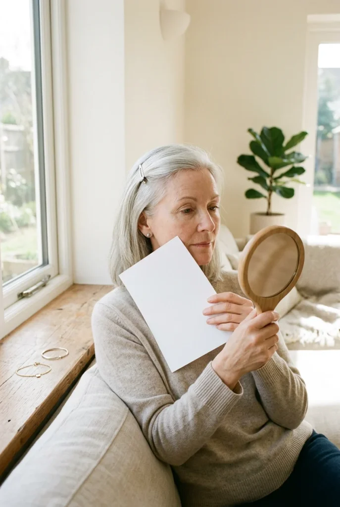
Your undertone is the color under your skin, and it stays the same your whole life. Lamps add yellow and fool you, so test in daylight only.
- Stand by a window between 10 a.m. and 2 p.m.
- Wash off all makeup and clip your hair back.
- Hold 1 sheet of white printer paper against your cheek.
- Check the veins on your inner wrist.
Golden skin and green veins mean warm. Pinkish skin and blue veins mean cool. A mix of both means neutral. Can’t see your veins? Hold gold jewelry by your face, then silver. Whichever one makes your skin look smoother wins.
2. Check Your Contrast Level
If a bright top ever made you look tired, contrast is usually why. Stand about 2 feet from the window, take a selfie, and switch on the black-and-white filter. Big light-and-dark gaps between your hair, skin, and eyes mean high contrast, so go deep and bold.
Soft grays that blend mean low contrast. Pick lighter shades, or keep bold ones small. Somewhere in between? You’re medium, and most of the palette works for you.
Gray or white hair usually lowers your contrast. It also reads cool. That’s why Luminous Blue, Peaceful Lilac, and Deep Green often look fresher on silver-haired women than the warm beiges they wore for years.
3. Save the 2027 Color Trends Chart for Women Over 50
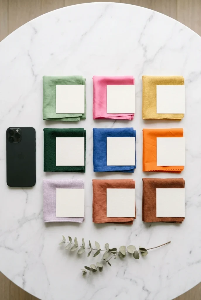
9 shades make up the 2027 palette. They come from WGSN and Coloro, the color forecasters many clothing brands plan around. Their 2027 Color of the Year is Luminous Blue, a deep cobalt close to lapis stone. Spring shades run bright and playful, while fall shades go rich and earthy.
Here’s why this palette suits us: more than half of it is soft or earthy, and that’s far kinder to mature skin than neon. Screenshot the chart below so it’s on your phone when you pick up paint chips or shop.
4. Hold Each Shade Under Your Chin
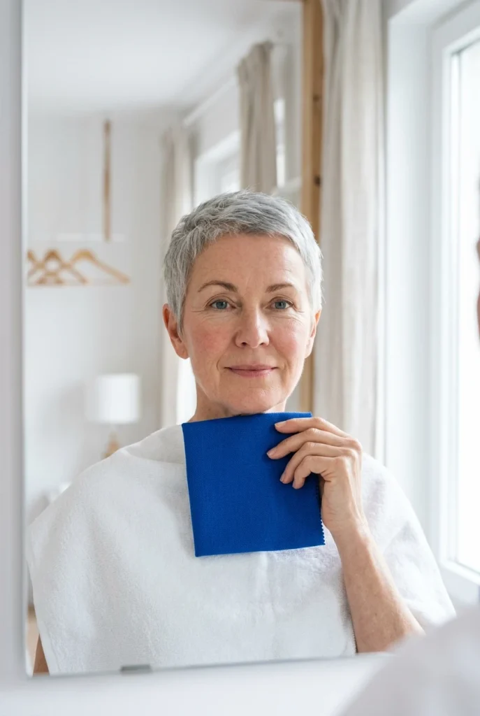
Give yourself 20 minutes and good window light for this one.
- Drape the white towel over your shoulders to hide your top.
- Hold one paint chip flat under your chin.
- Count to 5 while you watch your face, not the chip.
- Mark the chip with a ✓ or an ✗.
A good shade softens shadows under your eyes and makes your skin look even. A wrong shade pulls out redness, lines, or a gray cast. The towel matters because your top bounces its own color onto your face and throws off the test.
Your eye will run to the colors you already love. Watch your jawline and the skin under your eyes instead. If you keep staring at the chip and not your face, that shade is wearing you.
5. Pick Three Winning Shades
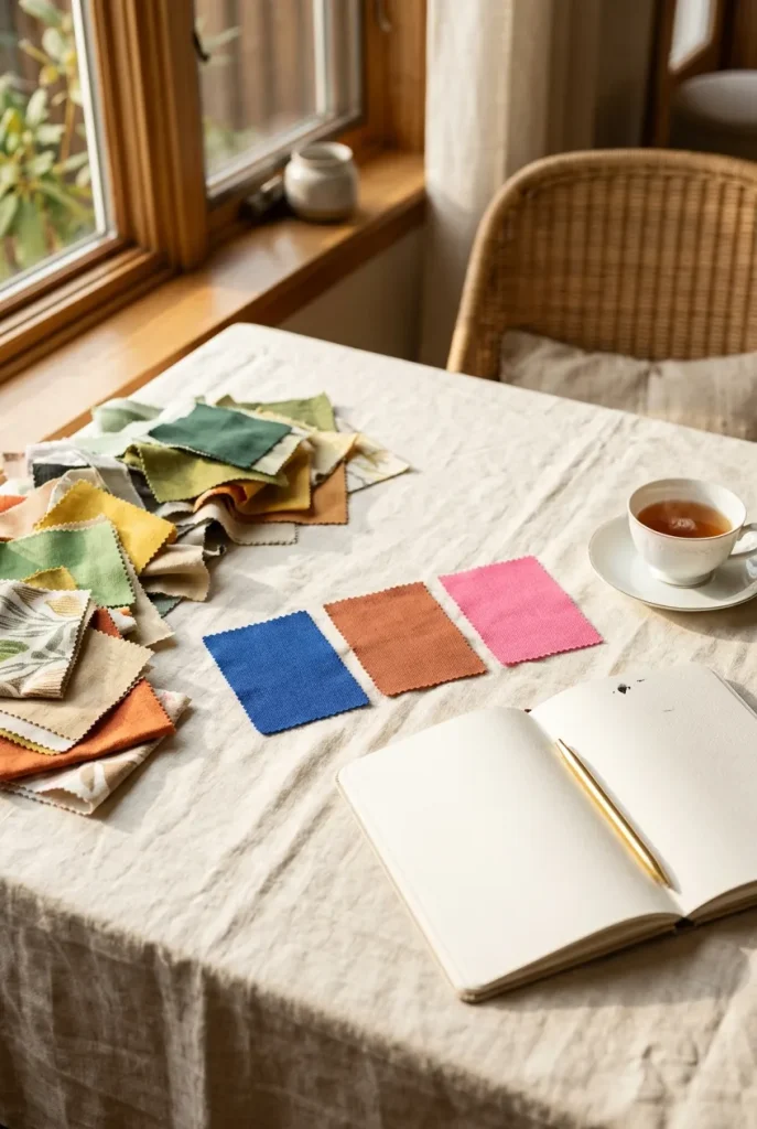
4 to 6 checkmarks is normal. Narrow them down to 3. Your hero is the chip that made your face look brightest, so you’ll wear it closest to your face. Your soft shade works like a neutral. Your accent is the fun one you’ll wear in small doses.
Three colors mix with your basics, so fewer pieces give you more outfits. Stuck between two? Use the chart below.
6. Pull Your Best Neutrals
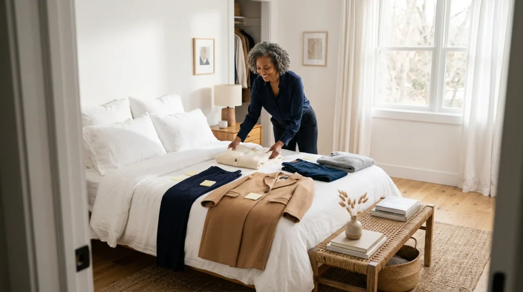
Your closet already holds half of your new outfits. Pull every navy, cream, white, gray, camel, and denim piece onto the bed. Keep only what fits today and shows no pilling or fading, because tired basics make new color look cheap.
Put a sticky note on each keeper. Black can stay, but navy and cream flatter more of the 2027 shades.
7. Write a Five-Item Shopping List
Why stop at five? Five pieces in three colors give you a dozen or more fresh outfits with the neutrals you already pulled.
- 1 top in your hero shade
- 1 cardigan or knit in your soft shade
- 1 accessory in your accent shade
- 1 neutral that fills a gap from Step 6
- 1 wild card in any of your three colors
Write a price cap next to each line. About $30 per piece keeps you under $150. The list also stops you from grabbing sale-rack colors that failed the chin test.
Also Read: How to Style Jeans for Women Over 50 With a Chic, Modern Look
8. Start With One Accent Accessory

Bold color feels safer away from your face, so start there. Buy your accent piece first: a tote, a belt, or a pair of flats. It goes with the outfits you already wear from day one.
Pop Pink flats with navy pants look modern, not loud. Already own something in your accent shade? Skip this purchase and wear that.
Wear your accent color in two small places, like pink flats plus a pink earring. Two touches look planned. One on its own can look like an accident.
9. Feel the Fabric Before You Buy
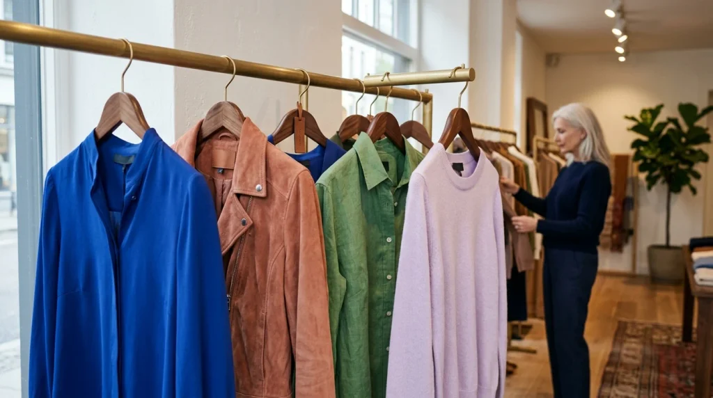
3 seconds of rubbing the fabric between your fingers tells you more than the price tag. Thin, shiny, or stiff fabric makes bright color look cheap and shows every bump. Matte, soft texture does the opposite.
It calms strong shades like Energy Orange and Luminous Blue so they look rich. Hold each top up to the store light, too. If you can see your hand through it, it will cling. Check the label for cotton, linen, wool, or viscose blends.
10. Build Your First 60-30-10 Outfit

Stylists and interior designers both use this split because the eye reads it as calm. 60% of the outfit is neutral, like navy pants and a cream jacket. 30% is your hero or soft shade, usually the top. 10% is your accent: flats, a belt, or earrings.
Lay the whole outfit flat on the bed before you put it on. Seeing it laid out shows you if one color is fighting for attention.
11. Swap Your Lipstick to Match
If the new top looks great but your face looks faded, your lipstick is usually the reason. Old lip shades were picked for old clothes.
- Put on your hero-shade top.
- Try each lipstick you own, wiping off between tries.
- Blot once so the color looks natural.
- Keep the one that makes your teeth look whitest.
Warm undertones do well with coral, brick, and terracotta. Cool undertones lean toward berry, rose, and plum. Nothing works? A rosy-brown tinted lip balm costs under $10 and suits most women over 50.
12. Wear the Look for One Full Day
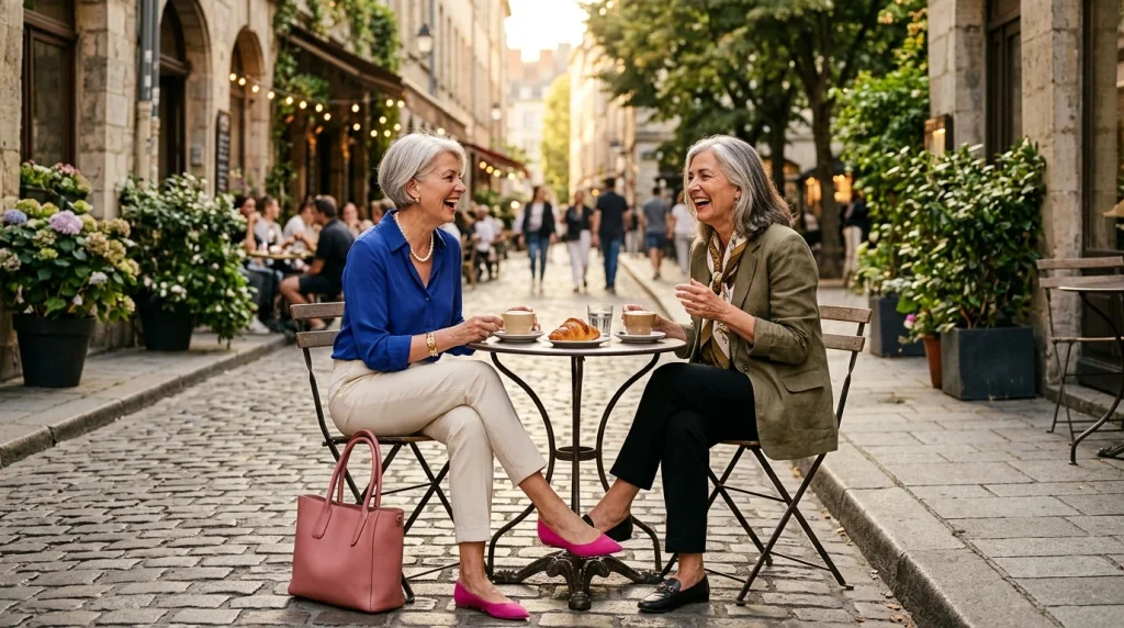
One normal day tells you more than an hour in front of the mirror. Wear your new outfit to run errands, meet a friend, or work from home. Snap a photo in daylight around noon, then again under lamp light after 6 p.m.
If you like both photos, the color is yours. Hang the full outfit on one hanger so it’s ready next week.
Don’t let one comment decide for you, good or bad. Judge the color by how you feel at hour 6. If you forgot you were wearing it, that’s a win.
Troubleshooting: If This Happens, Try This
What Changes After This Guide
- ✖ A closet of black, navy, and beige
- ✖ The same 3 outfits on repeat
- ✖ Colors that looked good on the hanger, not on you
- ✖ No idea which shades suit you now
- ✖ A lipstick picked years ago
- ✔ You know your undertone and contrast
- ✔ 3 tested 2027 shades that light up your face
- ✔ 5 or fewer new pieces, $150 max
- ✔ A dozen or more fresh outfits from what you own
- ✔ A lip color that matches your new palette
Your Printable Cheat Sheet
- □ Mirror + daylight window
- □ White printer paper
- □ Gold + silver jewelry
- □ 9 paint chips
- □ White towel
- □ Phone (B&W filter)
- □ Sticky notes
- □ Your lipsticks
- □ Budget: $0–$150
- Undertone: paper + wrist veins, 10 a.m.–2 p.m.
- Contrast: B&W selfie, 2 ft from window
- Save the 9-shade 2027 chart
- Chip under chin, 5 seconds each
- Choose hero, soft, and accent shades
- Pull neutrals that fit; tag keepers
- List 5 items, about $30 each
- Buy the accent accessory first
- Rub fabric 3 seconds; matte wins
- Dress 60% neutral · 30% hero · 10% accent
- Lipstick test: whitest teeth wins
- Wear it 1 full day; photo at noon + 6 p.m.
1 thought on “Find Your Best 2027 Color Trends For Women Over 50 in One Weekend”